
A quick note before you read this one: Mutineer isn't a client project, it's a brand Jeffrey and I toyed with launching ourselves a few years back. We shelved the actual company, but we kept coming back to the idea, so we decided to build it out in full: identity, brand system, and go-to-market strategy. Just us, doing the work we'd do for a client, on something we got to invent from scratch.
The brief we gave ourselves: build a brand for the person still sitting in the meeting, still hitting the deadline, still passing every inspection — who has quietly decided none of it gets to define them.
Mutineer is office-appropriate clothing built around a simple idea: you can still show up, still pass inspection, still do the job... while quietly signaling to everyone else who feels the same way that you haven't lost yourself to it.
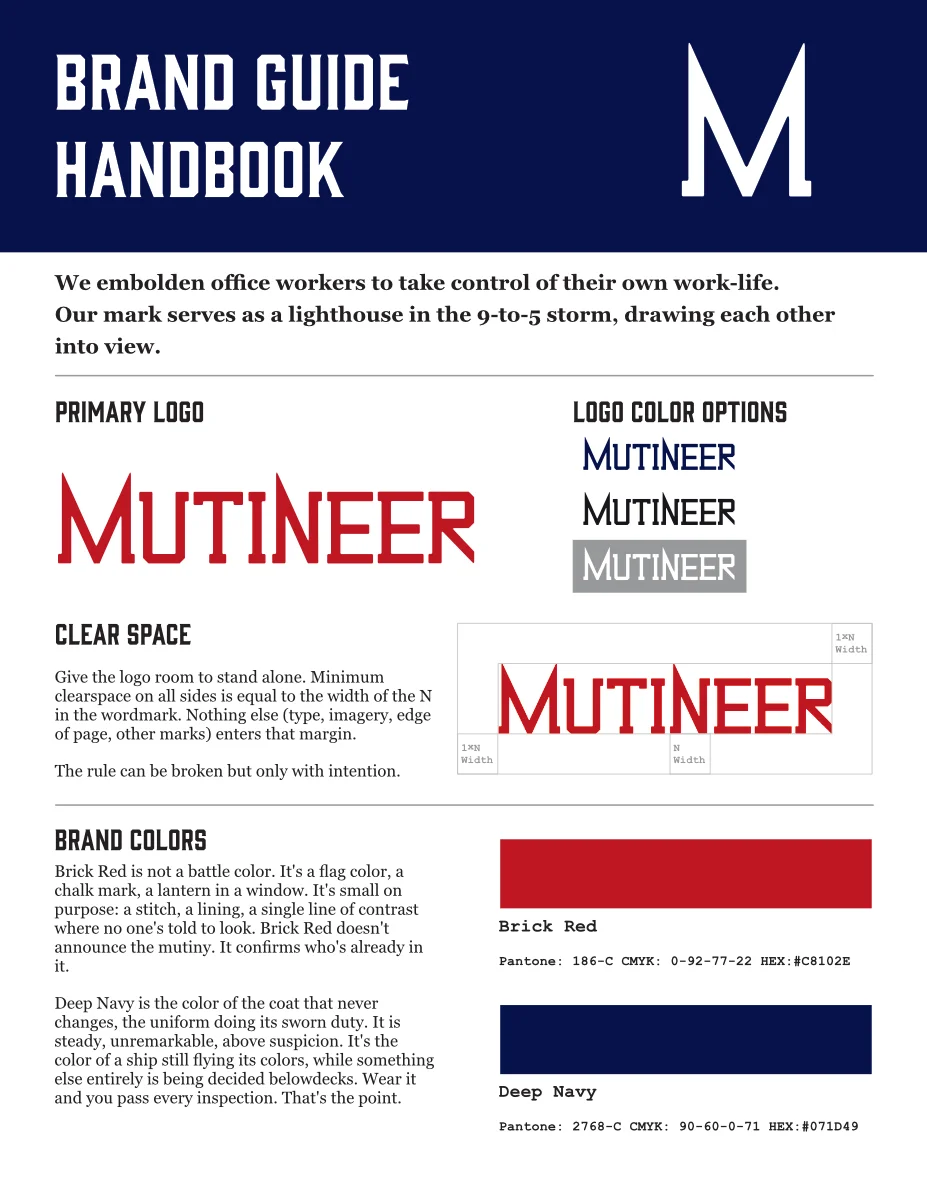
The identity system runs on two colors doing very different jobs. Deep Navy is the uniform: steady, unremarkable, above suspicion. Brick Red is the signal: small on purpose, never a base color, reserved for the mark only some people clock. A full neutral fleet (Alabaster, Silver Grey, Grey Olive, Eigengrau, White) does the quiet structural work so Navy and Red stay the only two colors that carry meaning.
Typography follows the same discipline: Gin Test announces, Georgia explains, Courier New files it away, and the Mutineer script signs it — one word, max, per composition. The photography direction pushes the same restraint even further: documentary, not catalog, natural light only, one accent color per frame. Shoot it like you weren't supposed to notice the logo — until you did.
Check out the full Brand Guide Handbook HERE
Here's the insight the whole system is built on: Office workers aren't quitting quietly. They're complying loudly, while quietly building a life their employer can't see.
RTO mandates, "quiet quitting" backlash, and surveillance-heavy management tools mean workers are performing engagement more than ever. But nobody's leaving. They're building a self that exists alongside the job, unclocked and unmonitored.
The category gap: workwear brands sell polish. Streetwear sells rebellion. Nobody was selling both, in the same garment, to the same person. No brand currently helps someone look compliant while feeling sovereign.
That's the bet Mutineer is built on. Not another workwear label — a signal system disguised as one.
Check out the Brand Lookbook HERE
We mapped a full three-phase go-to-market, treating the brand's own "signal vs. uniform" logic as the operating model for the launch itself:
Pre-Launch — Recruiting
Seed the signal before the product exists: Reddit and niche-community listening, giveaway tees partnered with active users, infiltrating business conventions with info cards. It's all recognition-bait for people already feeling this way, ahead of any explanation.
Launch — The Reveal
Product goes live framed as already in use by a crew, not a new brand asking to be noticed. Sold at booths positioned deliberately at conventions that skew individual-contributor (no leadership or management allowed). The room has to be the right room where there isn't a boss present.
Post-Launch — Fan Flywheel
The community sustains itself: user-generated content, weekly newsletters, pop-up shops placed where mutineers actually need them — financial districts, downtowns, startup hubs.
Where Mutineer shows up: Reddit and niche communities for listening and seeding, pirate radio and podcasts for unconventional audio reach, a limited-run zine built on customer-submitted "mutinous acts" (a workplace-flavored Post Secret), a newsletter functioning as the brand's own log book, and pop-ups as the one channel where the crew meets in person.
The signature campaign — "The Signal"
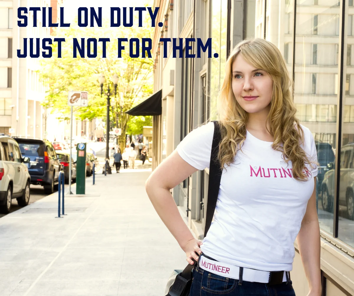
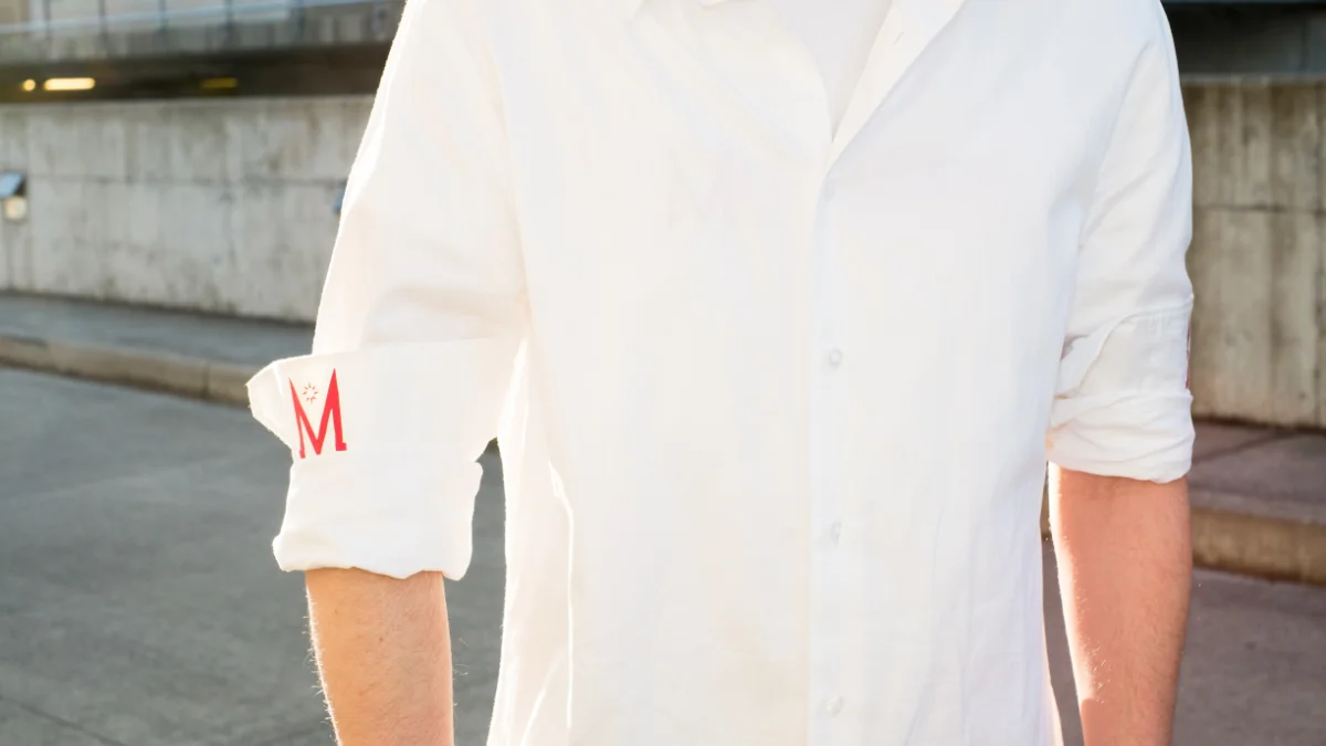
Most brands put the logo front and center. Mutineer's goes exactly where only the crew will find it: a mutinous M under a rolled cuff, on an undershirt, in a flash of lettering on a belt. Innocuous to leadership. The campaign doesn't chase reach, it's built entirely around the moment of spotting someone else's mark in the wild, because that recognition is the product.
Check out the full Go-to-Market Strategy Deck HERE
Because this was never launched, there's no real performance data — but we built the framework we'd hold the business to, and it deliberately optimizes for the opposite of vanity metrics:
Recognition over reach, in the metrics as much as the campaign.
"This is both our most fun and most strategically created brand. We had an absolute blast creating this and hope to see it in the world someday."
We could have shown you a logo and a lookbook and called it a portfolio piece. We built the strategy underneath it instead, because that's the part that's harder to fake and the part we actually want to be hired for. If you're evaluating us for identity work, brand strategy, or — ideally — both at once, this is the clearest answer we have for what that looks like end to end.
Explore the full project:
Want to see similar results for your business?
Schedule a discovery call ->